Emily Wicks
2022
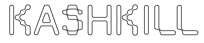
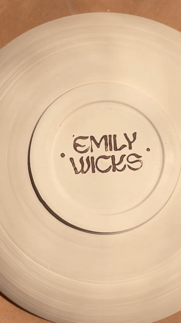
Brand identity and website design for fine artist & ceramicist Emily Wicks. The organic typeface her brand identity centers around draws from water and fire elements, referencing the ceramics process and connections to the earth and the body in Emily’s work. The dot motif also comes from a personal connection, and shows up throughout her identity and site design.
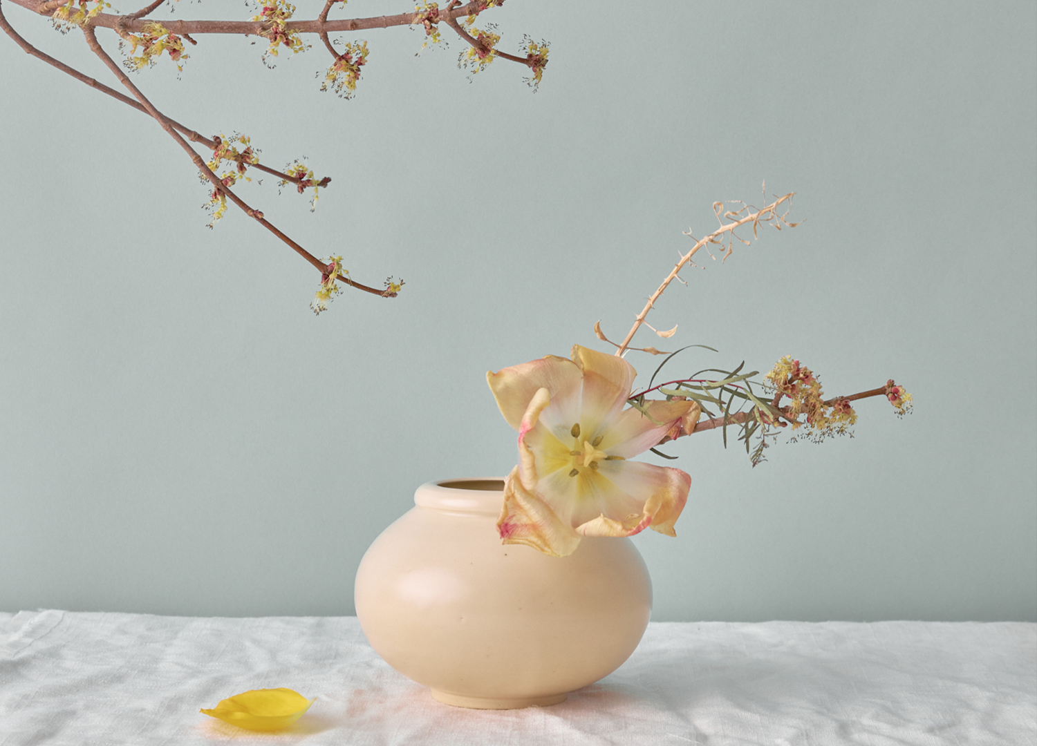
With a new identity in place, we rebuilt Emily’s site from the ground up — weaving in her new brand identity, expanding her site to include an online shop, doing a product photography overhaul, and creating a space dedicated to Emily’s fine art practice.


“Ten years ago blue dots and splotches of color appeared over my hands and continued to appear when I was cold or emotional. It became a way to acknowledge and connect to self / body. This connection felt important when thinking of my process, my work and how my hands are my most valued tools in what I do.”


Client: Emily Wicks
Photography: Ethan Hickerson
HOME ︎︎︎